To analyze the trends in your records, you can use Line Graphs in Ragic Reports. For example, you can track changes in blood pressure records, annual sales trends, or customer quantity variations.
If the sheet contains Numeric or Money fields and a Date field, you can create a Line Graph report. The "horizontal X-axis" represents the periods, while the "vertical Y-axis" shows the changes in values (numbers or amounts) over these periods.
You can generate different Line Graphs for data analysis and comparison by selecting various fields. Additionally, you can save reports with specific settings.
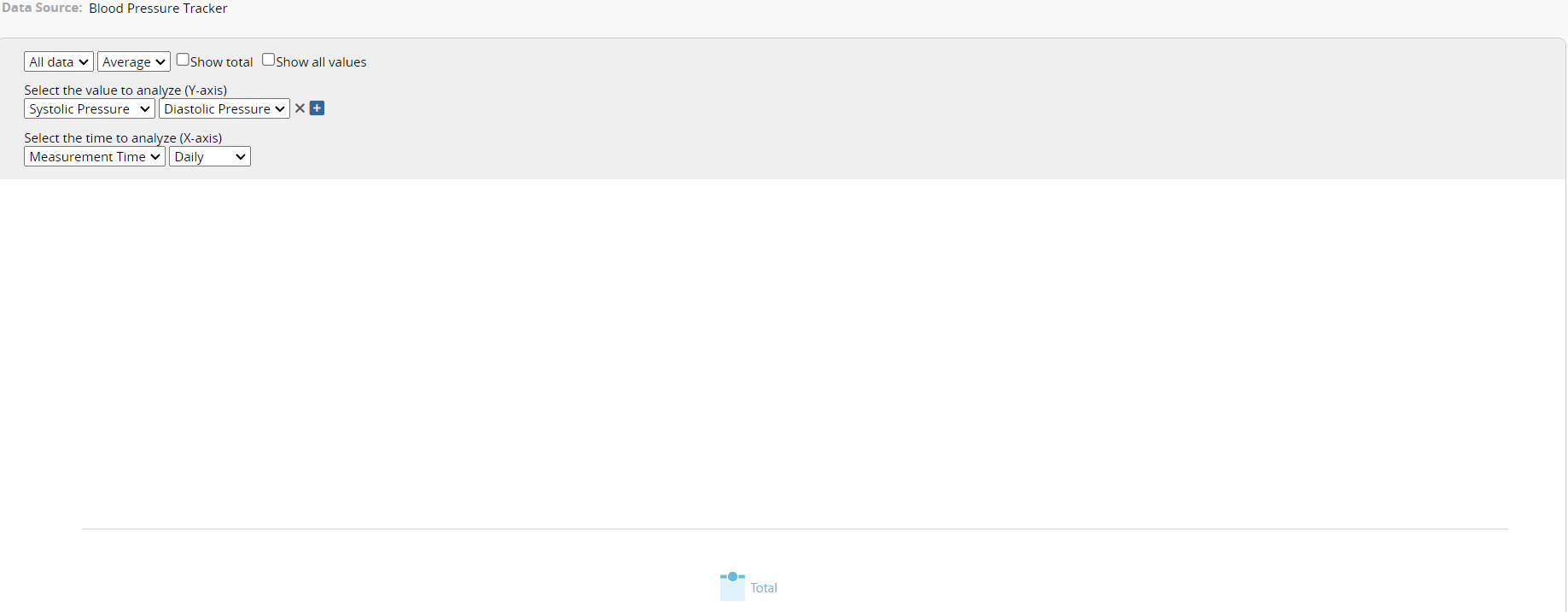
After creating the Line Graph report, the following page will appear. The top left block will display the fields from the sheet on which the current Line Graph is based.
The system will fetch some default fields, but you can select the desired fields for analysis from the dropdown menu.
The settings for the Line Graph are explained below:
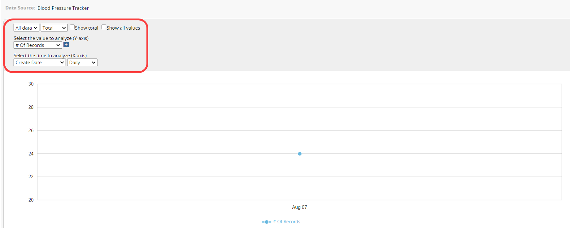
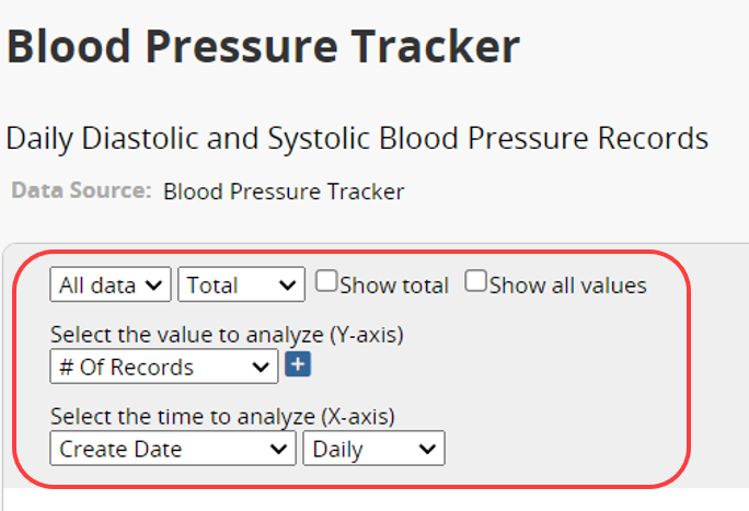
Click the dropdown menu on the left side of the first row to select how to group the data. The default option is "All Data". If you keep this option, the Line Graph will show a single line representing all unclassified numerical data from the source sheet.
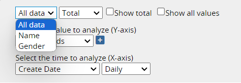
The other listed options are Selection, Multiple Select, and Select From Other Sheet fields from the sheet. For example, apart from "All Data", there are options such as "Gender" and "Name", which are Selection fields from the "Blood Pressure Tracker" sheet. When "Gender" is selected, the chart will display two lines: one representing data for males and the other for females.
You can then plot the Line Graph based on the "Total" or the "Average" of data.
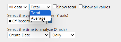
On the right side of the first row, you can choose how to display the data values.
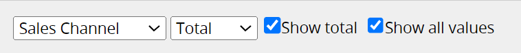
Selecting Show total will display the sum of all data values for each line. For example, when analyzing monthly customer count trends for different channels, this option will show the total monthly customer count.
Selecting Show all values will display each data point's value directly on the chart. If this option is not enabled, the value will only appear when you hover over the data point. 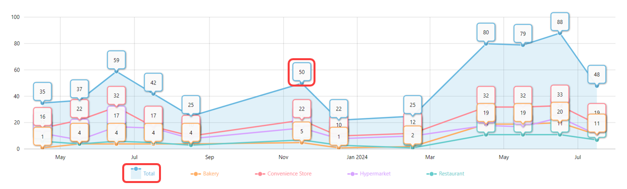
Click the icons for each data group below to choose whether to display the Line Graph for that category.
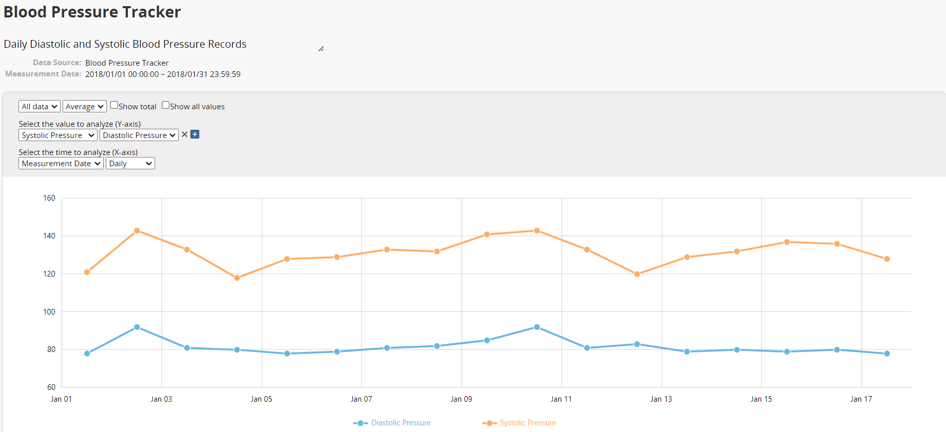
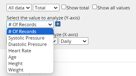
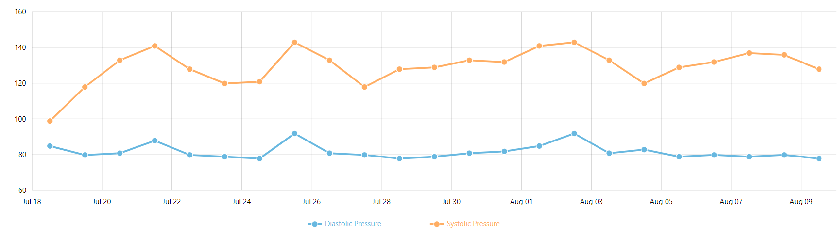
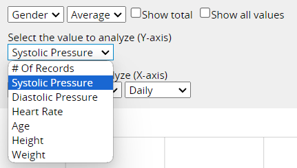
In the second row, you can choose the values to analyze (Y axis). You can select the # Of Records or Numeric /Money fields from the sheet. If you select "All Data" in the first row, a "+" icon will appear next to the dropdown menu. Click on it to add more fields for analysis. For example, you could select "Systolic Blood Pressure", "Diastolic Blood Pressure", and "Heart Rate", which will be displayed as multiple lines in different colors for simultaneous analysis.
If you have grouped the data (e.g., by gender), you can only select a single value field for analysis.
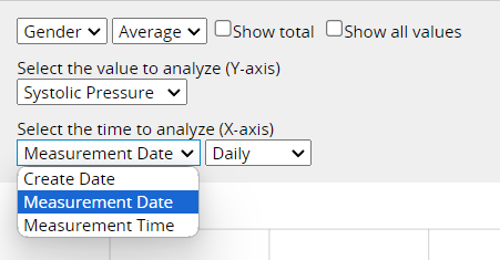
In the third row, you can choose the time for analysis. The system will list the Create Date of records and all Date fields from the sheet. You can also select the period for analysis, such as "Daily", "Weekly", "Monthly", or "Yearly".
Additionally, if the period for the data is long and results in a large amount of data on the Line Graph (e.g., "daily" blood pressure records over several months), a gray area will appear above the graph for adjusting the time axis. You can use this gray area to select the desired time range. Clicking the ![]() icon in the bottom right corner will return you to the original settings.
icon in the bottom right corner will return you to the original settings.
If the Line Graph is not generated when setting options, the current choices are not suitable. For example, choosing "Measurement Time" to analyze blood pressure records will not be compatible with periods like "Daily", "Weekly", "Monthly", or "Yearly", preventing the graph from being generated. Please adjust the settings and select the appropriate options for creating a Line Graph.
If you frequently use this type of report, you can save it for easy access later. Additionally, you can export the report as a PDF file or print it.
You can apply filters to generate the desired report.
You can embed the report into your website or share a link with others.
In the Report Settings, you can adjust the report’s style settings, including font, font size, borders, etc., and the report’s Filter and Access Rights.
 Thank you for your valuable feedback!